Tag: Philadelphia

Marks, Manicules, and Markland: Street Signage in Nineteenth-Century Philadelphia

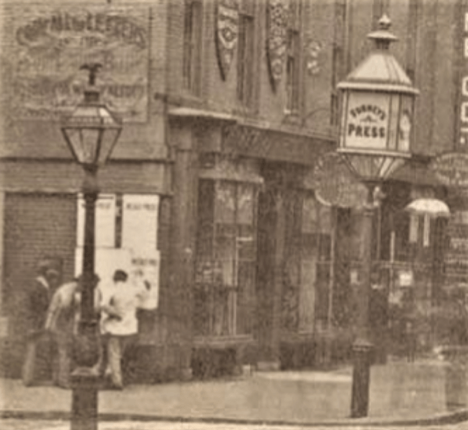
A signage doubleheader at Walnut Street and South Second Street NE, detail (HABS).

https://www.loc.gov/pictures/item/pa1198.photos.137212p/resource/https://www.loc.gov/pictures/item/pa1198.photos.137212p/resource/


Here we are in the famously gridded city of Philadelphia, in the 1830s, when Frances Trollope and Tyrone Power reported that the city was easy to navigate. As Power said, “the stranger’s course [is] an exceedingly easy one” (Impressions of America, During the Years 1833, 1834, and 1835 [1836], 1:81). But there in the Public Ledger of July 25, 1836, is an anonymous rant claiming that it is impossible to find one’s way around Philadelphia, even for elderly Friends who have lived here all their lives. Navigation Continued: “Marks and Numbers of Streets,” from the Philadelphia PUBLIC LEDGER, 1836


Is this really a contradiction? If we think about legibility, the patterning or reference system described by Kevin Lynch, we can say that Philadelphia was compact and regular, set out in the narrow waist between two rivers. Inhabitants should always have known where they stood in relation to the points of the compass, the rivers, and agreed-upon local landmarks.


The complaint in the Public Ledger was about legibility in a less sophisticated sense. The city was impossible to navigate, it was claimed, because of the regularity and similarity of the streets, which made blocks look alike (a point also made by Frances Trollope), and because there were scarcely any street signs, except for a few faded boards, possibly relics of Penn’s era. Streets could be found by counting squares on a map. The grid needed guide boards.


Could it be that the former national capital, the city of the Society of Friends and of Benjamin Franklin, was so lacking in civic common sense as to neglect street signage? And what about all the inset marble (or brownstone or metal) street signs, often paired at the corner, that survive on brick buildings in old neighborhoods? About 240 have survived demolition, stucco, and siding. About a quarter of those signs–prized among the prizes–are for street names that no longer exist (please see my Flickr album of signs). If those signs did not exist in 1836, when did they go up? And who was responsible for them?


Old images are full of street signs, but they appear incidentally. Marble, metal, or painted wood–it’s hard to tell, though signs that were affixed rather than inset tend to have shadows at the bottom. A search of old images found more than fifty vanished signs that were probably inset, and made of marble. About twenty of them are in pairs, usually meeting at the corner.


Those images can’t tell us when the signs went up. Records of street name changes provide the earliest possible dates for signs. The records also provide latest possible dates for former-name signs. It seems that, of the former street names, ten changed at dates yet unknown, five changed in 1858, and about thirty changed in 1897. Indeed, if you look at the Bromley atlas for 1910, you will find current names all over town. A few names turn up in maps after being changed by the city (e. g., Hull for Elkhart in the 1910 Bromley). The still-ubiquitous white on blue wall signs turn up in photos starting about 1900. Everyday incised signage seemed to wane with the century, though many buildings before and since have been designed with incised (or separate-letter) street signs to add gravitas to banks, electric stations, or self-conscious new housing.


Was the city responsible for the incised signs? Not according to Common Council records (available for ca. 1836-1919, with possible gaps, thanks to the HathiTrust). It is unlikely that the city, which had to change signs when the names changed, would have been scraping out and replacing incised signs. Our dozens of former-name survivors suggest that that was not done. We can’t know how many incised signs existed, or where they were, but enough old images show brick corner buildings without street signs, to suggest that they did not go up according to a plan. Besides, though almost all the signs are at stringcourse level, some are a story higher; some corners have paired signs and others only one. We find a both-ends, opposite-sides signage plan on a few blocks of surviving speculative housing: Silver (Bishop) and Seltzer (Coffman) between Thirteenth and Park; Darien above Somerset; Napa (Chalfont) between Spring Garden and Hamilton; and Wakefield (Fairfax) between E. Price and E. Rittenhouse. But developers of uniform blocks left hundreds of corner buildings without incised signs.


Then what did the city do about signage, and what types are mentioned in the records? Clearly, it was managing street signs by the late 1830s. (Perhaps the ranter of 1836 was an unsung hero, an instigator of signage reform.)


In Common Council records for the late 1830s, there are repeated references to the painting, putting up, repairing, and updating of street signs. The city also monitored damage to, and removal of, signs. Appropriations for these services were a regular part of the budget. At the end of the 1830s, the council considered plans that were carried out at the time of consolidation: numbering north-south streets from the Delaware to the Schuylkill, rather than numbering from both rivers toward the center; and adding directions N, S, E, and W “at the corners of all the Streets and Alleys” (street signs were no longer rare), “E” and “W” breaking at Broad, not, as we see now (for the most part), at Front.


With marble signs, we have little history, but plenty of examples. With municipal signage before 1900, we have lots of history, but few surviving examples. Several types of signs are mentioned, but the terminology seems vague, flexible, and changeable. Why define precisely what everyone sees every day?


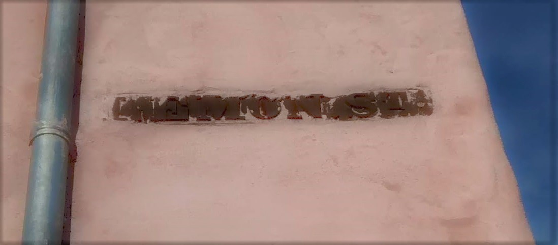
The 1836 complaint speaks of old guide boards of the “shape, size and color of a weather beaten shingle.” City records from the 1830s to ca. 1900 speak of corner signs, painted and apparently wooden (they were made and maintained by a city carpenter), finger boards or fingerpoints, painted index boards, index plates (possibly metallic), and sign boards. The metallic signs might have been painted like the white on blue wall signs, or “typeset” from metal letters, like the ones that survive at Lemon and Tenth NW, Pine and Ninth SW, and Waverly and Sixteenth SE (with the former name, Stone). If we can trust image searches, it seems that guide boards (1836), direction boards (1837-39), index boards (city records, intermittently, 1838-80; but John Fanning Watson [Annals of Philadelphia. . . 2: 492] had noticed index boards ca. 1800), and finger boards (1839, 1840, 1841, 1854), might point away from themselves. Sign boards (1848, 1857-74, 1883-89, 1891-95, 1897-1912) may be the rectangular, non-pointing signs in old images, fastened to the wall (as a board would be), rather than inset. (Or they might be marble insets.) A survey of old images revealed about twenty that could show one or the other, with another thirty most likely sign boards.


In the midst of these ambiguous and overlapping designations, two old signage styles stand out.

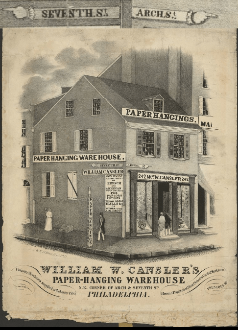
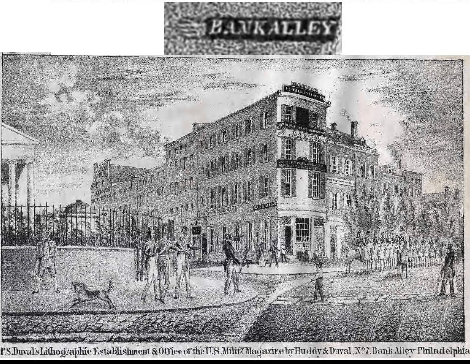
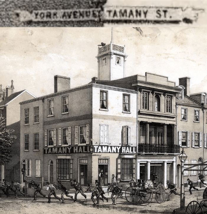
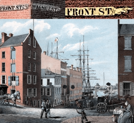
The first to appear was the fingerpoint or finger board, a wall sign (also seen in clusters on a pole, at highway intersections) with a pointing hand at one end, like the manicule in the margin of an old manuscript (or pointing up or down on a tombstone). I have found about 48 fingerpoint signs in old Philadelphia images.

Arch Street and North Seventh Street NE, ca. 1845, and detail. Library Company of Philadelphia Digital Collections.
https://digital.librarycompany.org/islandora/object/digitool:67925

Bank Alley and Dock Street, ca. 1839, and detail. Library Company of Philadelphia Digital Collections.
https://digital.librarycompany.org/islandora/object/digitool:35925

Tamany (Buttonwood) Street and York Avenue (part of the lower end, now existing only in small sections, of Old York Road), ca. 1851, with detail. Library Company of Philadelphia Digital Collections.
https://digital.librarycompany.org/islandora/object/digitool:65515

Walnut Street and South Front Street, ca. 1855, with details. Extra points for finding a fourth fingerpoint here! Library Company of Philadelphia Digital Collections.
https://digital.librarycompany.org/islandora/object/digitool:65655

They are charming, but puzzling. Pointing signs usually direct attention away from their location, but the decipherable fingerpoint signs seem to be on the streets they name. “FRONT ST.” on the Front Street side of a building is a label, not a pointer. Then what does the pointing mean? The orientation is not toward the corner; some point away from the corner. Perhaps they regulated traffic? I found three Chestnut Street fingerpoints, all pointing east, but that could be coincidence. And why have traffic regulation on Plynlimmon Place, a dead end narrower than nearby Elfreth’s Alley? In fact, one-way streets seem to have appeared here only in the twentieth century.

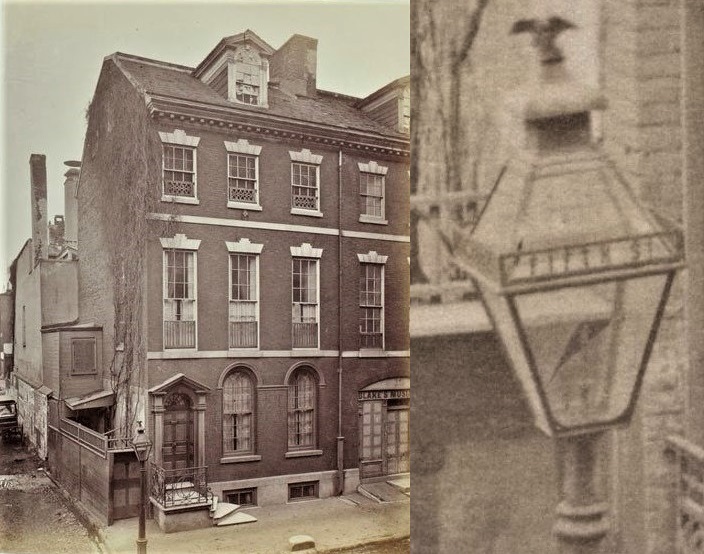
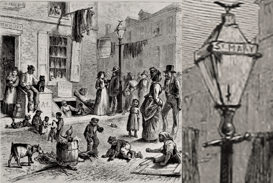
The second example of striking signage shows how sidewalk corners pick up public functions. As rowhouses acquired porches, bay windows, elaborate corbels, turrets, and abundant greenery, wall signs persisted, but might have been hard to see. For other buildings, like houses of worship, they seem to have been considered inappropriate. So, while also taking into account the increasing speed of travel, sidewalk signage became attractive. In 1868, Thomas T. Markland Jr. patented a “new and useful Improvement in Street-Lamps and other lamps,” which he proposed for use in Philadelphia. His improvement was “street-lamps with name-plates in the main body of the lamps, but [attached to the frame and] separate and distinct from the large glass plates,” so the names would not be lost if the plates broke. Markland’s patent speaks of perforated letters, but the Common Council speaks of “block letter[s]” with spaces in between, as shown in the right-hand image below, and in other old images. There would be signs on all four sides, so that the street names could be seen from all directions. (By the way, note the contrast below between Fifth and Fifth and Chestnut and Fourth.) They were also, unlike wall signs, at their best after dark.

T. T. Markland Jr., street lamp patent, 1868.


This system was taken up by the city, but coexisted with other forms, so that we read of money for “sign boards at the corners of streets and street names on lamps” (1884-85), and of expenditures for “street names upon the public lamps, sign boards, and road posts” (1887-1912). The first image in this article shows a rare corner (Walnut and Second NE, ca. 1869) where a surviving fingerpoint sign (the hand is on the right above the first “R” in Krider) coexists with Markland signs. Unlike the marble signs, the Markland name-plates seem to have been added systematically. In photographs from the decades after the patent, one can see lamps with street names at one corner after another in Center City, especially on Chestnut, and as far north as Broad and Stiles, or perhaps (in a sketch from Perspective of Philadelphia in 1886) at Columbia and Tenth; other possibilities include Butler and Second and Market and Thirty-eighth. I found about 24 clear images of street lamps with signs, with 13 images too faint for certainty. In images of the time there are many corner lamps without name-plates; perhaps the signs were concentrated in Center City.


At a favored intersection, which, or how many, corners got the signage lamps? The Markland lamps in old images are divided almost equally among the four corners. But the Library Company has two images from ca. 1868 that show Markland signs at Walnut and Fourth, on the NE and SW corners.

Chestnut Street and South Seventh Street, ca. 1870, 1876, detail. Library Company of Philadelphia Digital Collections.
https://digital.librarycompany.org/islandora/object/digitool:101901
Chestnut Street and South Nineteenth Street, ca. 1875, and detail. Library Company of Philadelphia Digital Collections. [Chestnut Street east from Nineteenth Street, Philadelphia] [graphic] / James Cremer, photographer and publisher, 18 South Eighth Street, Philadelphia. | Library Company of Philadelphia Digital Collections
Ranstead Street and South Fifth Street, and detail. Library Company of Philadelphia Digital Collections (scroll down in album). Photograph album of Philadelphia and vicinity [graphic]. | Library Company of Philadelphia Digital Collections
St. Mary [Rodman] Street, and detail. Edward Strahan (pen name of Earl Shinn), Picturesque Glimpses of Philadelphia and Pennsylvania (1875), p. 185. Internet Archive.

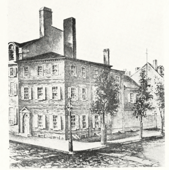
Lamps could combine multiple public functions on a sidewalk corner: illumination, signage–and a mailbox, following the 1858 patent by Albert Potts. Images of Arch and North Seventh NW (across from the site of the ruffled fingerpoints!) show the house known as Fort Rittenhouse with a plain street lamp; with businesses moved in and a Potts letter box added; with different businesses, the Potts letter box, and Markland signs; and a successor building with the signs and a round-top letter box.

“Fort Rittenhouse.” Charles J. Cohen, Rittenhouse Square: Past and Present (1922), p. 299. Internet Archive.
Library Company of Philadelphia Digital Collections (scroll down in album). https://digital.librarycompany.org/islandora/object/digitool%3A119977#page/6/mode/1up
Library Company of Philadelphia Digital Collections (scroll down in album). https://digital.librarycompany.org/islandora/object/digitool%3A119627#page/37/mode/1up
Photograph from 1885, and detail. Library Company of Philadelphia Digital Collections. https://digital.librarycompany.org/islandora/object/Islandora%3A4233

Advertising on lamps (perhaps not city-owned lamps) also turns up in old images (see Chestnut and Seventh above). Advertisements were not restricted to corners, or to lamp posts, but also appeared on lamps attached to buildings. Unlike the street names on Markland’s shatterproof name-plates, the advertising was usually applied to the glass itself, but there was at least one lamp that put a business name (THE TIMES, at Chestnut and Eighth) on a metal strip.


The Markland lamps and their competitors went the way of gas lamps here and elsewhere, but in the garden of the Peale Center for Baltimore History and Architecture, and at the Baltimore Streetcar Museum, you can see a few “street names upon the public lamps.” That is not to say that they are Markland’s name strips; the street names are black on a white opaque background, the style seen in images of working street lamps in Baltimore. In Boston, a collector added, or restored, sign plates to a lamp from the intersection of Salem and Hull.


The editorialist of 1836 should have been pleased with fingerpoints, sign boards, and lamp signs. But what would the writer have made of the 1915 proposal discussed in Common Council to place “street names on telegraph, telephone, electric light, or other poles or posts”? Definitely a topic for another time.

Navigation Continued: “Marks and Numbers of Streets,” from the Philadelphia PUBLIC LEDGER, 1836

Navigation Continued: “Marks and Numbers of Streets,” from the Philadelphia PUBLIC LEDGER, 1836

We hope that the examination of old advertisements in

Navigation

and

You Must Take the Red Car

has shown how hard it was for Philadelphians to find a building under the old system of numbering. Below is an anonymous complaint about the difficulty of finding streets in our famous checkerboard of a grid, without the help of markers or signs. This is not an advertisement, though it is a newspaper article, and it has been transcribed for ease of reading.

Public Ledger, 25 July 1836, page 2

Marks and Numbers of Streets.—Every stranger, —psha! every resident, yes! every resident, even among those who were born and reared and raised and brought up in our right-lined, right-angled, right-looking, right-conducting city, must have experienced, at least once per day in his life, especially if he have lived long, the difficulty of telling his whereabout [sic], his bearings and distances, latitude and longitude in our streets. He may start from any given point, which he well knows when he sees it; as, for instance, Mr. Pagoda Arcade Brown’s arcade [see below]; but before he can get to the distance of five squares, he is totally on soundings and lost in the fog, and can no more tell where he is, than a sailor when out of sight of land, and the sun cannot be seen for taking an observation. We are daily accosted by elderly citizens, inquiring the way; many of them in the garb of Friends, and therefore genuine Philadelphians; people who have been born in the city, and have seldom been out of it. Not wishing to confess ignorance, we always reply that we are strangers. It goes against our grain thus to fib about the matter. But what can we do? By confessing ignorance, we must either libel ourselves or the streets, and we have too much self-respect, and too much respect for the streets, to libel either. And so we get over it by a white one now and then. Besides, we are sometimes tempted to read Jemmy MacFib’s Gotham Herald [perhaps James Gordon Bennett Sr.’s New York Herald], and “evil communications corrupt good manners.” The fact is, the streets are all alike. They are of the same length, breadth, thickness, height, complexion, appearance, aspect, look, countenance and configuration. They look as much alike as so many bed cords, spun by the same hand, upon the same wheel, of the same number of strands, out of the same lot of hemp. They have no difference, distinction, discrepancy, dissimilitude or dissimilarity. Each looks like all the rest, and all the rest look like each. They are all dressed in uniform like a volunteer company,

The streets of Gotham look like its own regiment of fantasticals; or rather like the farmer’s sons, of whom none looked alike but Benjamin. Each has its peculiarities to strike the eye, the ear, the nose or the shins. One has some half dozen magnificent churches, with steeples towering far above the city smells, into the regions of pure air. Another has no steeples at all, but is distinguished by shanties, pig styes, and slaughter houses. One is full of carts and drays, clattering like Milton’s devils in a pandemonian dispute. Another is full of omnibuses, roaring like Niagara, with the occasional scream of a woman or child, run over by the sober and orderly and well regulated drivers. The mud in one is knee deep; in another it reaches only to the ankle; while in a third, you sink over head, as in a Lybian quicksand. In one the eye is regaled by scores of dead cats; in another the nose is saluted with the odors of sundry dead dogs. In Broadway you are knocked down by an omnibus, in Pearl street by a cart, and in the Bowery by the Chicester gang. In short, no two are alike, each has its distinguishing characteristics, and you can not only tell where you are, but always perceive that you are where you ought not to be. But notwithstanding these striking, imposing, convincing differences, yet you find a guide board at every corner. So if you stumble over a dead dog in one street, and afterwards, in your course, stumble over a dead dog in another street, you have only to look up at the corner, to perceive that you are actually in another street, that you have not wandered back to your point of departure, and that the second dead dog is actually a different dead dog from the first dead dog.

But how is it in this rectangular city, which must look to every crow that flies over it as it looks to mortals on the map, like a chequer-board or a checked shirt? In Market street you may occasionally see at a corner, something in the shape, size and color of a weather beaten shingle; and if the sun shine full upon it, you may discern a few lines of a shade slightly darker. What these marks import we know not, for we might as well decypher a charred manuscript from Pompeii in which the paper is burnt black, and the ink is—black too. Our oldest citizens tell us that according to a tradition which they received from their grandfathers, these faint lines were letters, and spelt High street.—There is a tradition that William Penn ordered guide boards to be put at each corner throughout the city, with the name of the street in fair letters, the board of one color and the letters of another. It is possible that these few brown shingles in Market street may be the remains of them. We will venture, with all due humility, to suggest to our city councils that much time might be saved, and much inconvenience and many vexatious disappointments prevented, by putting not less than two guide boards at every corner. For instance, at the intersection of High and Sixth streets, let one be on High, the other forming an angle with it on North Sixth, a third on High upon the opposite side, a fourth at an angle with it on South Sixth, and so throughout the city, at every corner. Let the boards and letters be of different colors; and we would suggest as a fact in natural philosophy, which we have read in some book, that black and white present the strongest contrast. Doctor Franklin once said of a book presented to him, that the paper and ink were too nearly of a color. The printer seems to have borrowed his notion from the old Market street guide boards.

To show the inconvenience to which strangers are subjected for want of guide boards in our verisimilitudinous streets, we would inform the councils that it cost Mr. Van Buren a walk of seven miles, to find the office of the Ledger. He walked from the Mansion House [located at 372 Market, at Eleventh, according to advertisements of 1840 and 1842] to the extremity of the Northern Liberties, and back to the extremity of Southwark, in pursuit of Chesnut street, and found a Chesnut street at every intersection. He then went up Spruce street from the Delaware to the Schuylkill, looking at each intersection for Sixth, and found they were all sixes and sevens. He knew Christ church because it had a steeple, and St. Andrew’s because it had a barn door; High street because it resembled a farm yard furnished with sheep sheds; the Arcade, because it resembled nothing in heaven above, the earth beneath, or the waters under the earth. But where to find the Arcade! At length he politely inquired if a building opposite to him were the State House [i.e., Independence Hall], and was told it was the Moyamensing Academy [likely Moyamensing Prison]. It is unpleasant for a stranger to be thus wandering about, like a turkey in the dark in pursuit of a roost.

♦  ♦  ♦  ♦

Now about “Pagoda Arcade Brown”! Peter Arrell Browne (after whom P.A.B. Widener was named) acquired this nickname from his friends or detractors, thanks to the coincidence of his initials with the names of two extravagant and unsuccessful projects he undertook with John Haviland: the 1826-27 Philadelphia Arcade (said to be the first shopping arcade in the United States, it featured scores of shops, restaurants, and other public businesses, as well as the Peale Museum) on the north side of Chestnut between Sixth and Seventh, and an 1828 pleasure garden, dominated by a pagoda a hundred feet tall, near the Waterworks. Poe, who lived not far from the site, satirized the fondness for pagodas in his architectural writing. There was a Pagoda Street in the area long after the pagoda was lost. The pagoda itself is marked in the 1831 Simons map, and the street appears in the 1849 Sidney, 1858-60 Hexamer & Locher, 1862 Smedley, 1875 Hopkins, and 1895 Bromley maps. In the 1849 and 1862 maps, the block of Wallace that runs east-west at the northern end of Pagoda Street (which would be called North Taylor now if the block still existed) is called Arrell. Browne was a lawyer, professor, and advocate for science; for example, for the establishment of a state geological survey.  He was active in the Franklin Institute, around the corner from the arcade in another Haviland building. The Academy of Natural Sciences holds his albums of presidential hair (it should be added that his studies of hair also led him to harmful racial theorizing); some of his samples were put on display during the 2016 election.
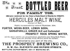
 

Destroyer of Souls, Preserver of Bodies: Two Faces of Alcohol

Destroyer of Souls, Preserver of Bodies: Two Faces of Alcohol

During the late nineteenth century, temperance became a mass movement, moving as a progressive cause toward the Eighteenth Amendment. In 1917 the American Medical Association voted in favor of prohibition, a year after whiskey and brandy were removed from the list of scientifically approved medicines.

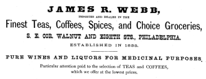
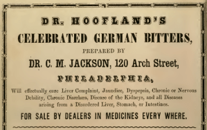
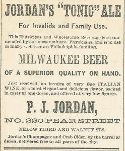
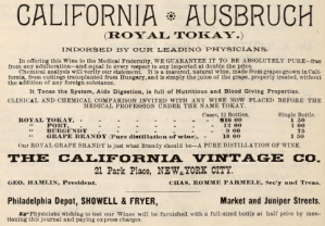
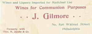
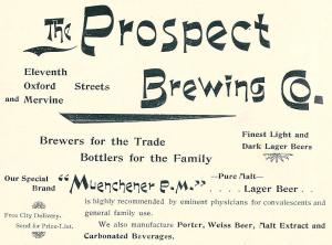
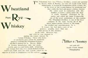
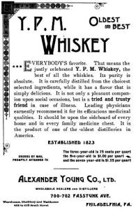
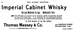
That ran against a long and respectable tradition of medicinal alcohol. The pre-Prohibition advertisements below do not speak of alcohol as, in the words of Carrie A. Nation, the “destroyer of men’s souls.” The first glass does not lead to the grave, as in the popular print “The Drunkard’s Progress,” but, when used in moderation, keeps users, young as well as old, out of the grave. Through sacramental use, alcohol benefits the soul as well. Medicinal and sacramental uses of alcohol are often paired in advertisements.

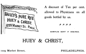
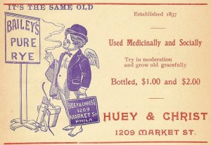
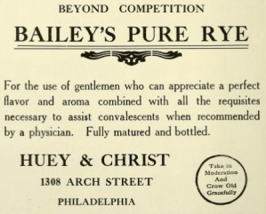
No matter what you think about drink and health, you might be startled by the rosy view of alcohol, especially hard liquor, in these advertisements. We may be reminded of old cigarette advertisements when we read of “leading doctors” who recommend one brand of whiskey for their patients. Advertisers sometimes allowed a hint of hedonism. For example, the 1903 mascot of Huey & Christ seems to be a combination of Puck, Cupid, and Peck’s Bad Boy, unlikely to “try in moderation and grow old gracefully.” But the firm’s advertising repeatedly linked Bailey’s Pure Rye with dignified aging, medical care (a nurse is shown ministering to a hospitalized man), and refined conviviality.

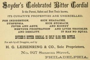
The advertisements for widely used bitters, bitter cordials, and bitter wine of iron, on the other hand, did not directly promote this cheerful view, because their sometimes hefty alcohol content was not acknowledged (the products were recommended for women and for children, who were said to cry for Snyder’s Celebrated Bitter Cordial). But it seems that most of these remedies contained alcohol, based on the manufacturing process and on independent tests, and that many people knew it.


“The objectionable column”: The Rise, Fall, and Imprisonment of the Canted-Corner Column

“The objectionable column”: The Rise, Fall, and Imprisonment of the Canted-Corner Column

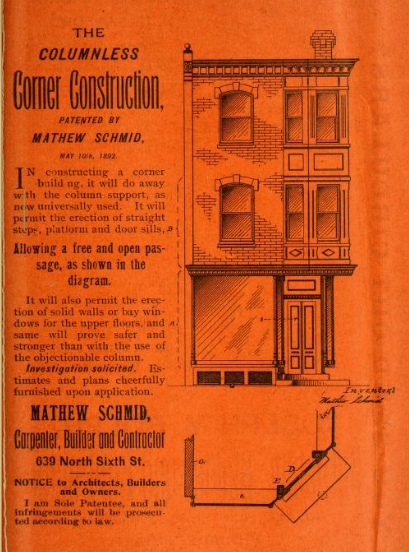
In the 1895 advertisement above, Mathew Schmid offers to relieve customers of a feature common in cities like Philadelphia. He does not have to explain that the classic up-to-the sidewalk rowhouse blocks of the late nineteenth century typically featured canted or diagonal first-story entrances at each end. The businesses that usually occupied canted-corner buildings could be seen from either side of the corner, and more readily seen as one approached them on either side–good for business. Dozens of of intersections still feature canted entrances on all corners. Very often an elaborate cast-iron column stood in the place of the lost corner. Schmid says that such “objectionable” columns were used almost universally. To this I would respond, first, that his invention must have transformed the construction of canted corners, because, to make a guess, fewer than half of the old canted corners in Philadelphia feature columns. Second, I would respond that the columns are not objectionable (though perhaps inconvenient on moving or delivery day), but attractive and even informative.

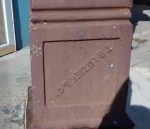
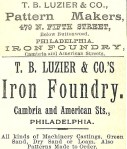
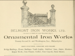
Here are some photographs of columns that display the names of their manufacturers, getting them under the bar as advertisements, and some advertisements for companies that made columns. (Unfortunately, the two groups don’t mesh as well as one would like.)


As you can see, many of the columns have been freshly painted. They clearly formed, and form, part of the decorative scheme of their buildings. But many columns were lost to the revenge of the rectilinear, when owners decided to favor one street over another, or wanted the building to be a house without a canted living room. To judge from surviving buildings, many of the restored corners never featured columns at all. Many of them are so heavily paneled or resurfaced that only old photographs can tell us whether there might be a column imprisoned inside. But sometimes we see columns that have survived the change from a diagonal entrance. Sometimes the old doorway is blocked and the column remains, no longer objectionable because it has no activity to block. Then it becomes abstracted, like a piece of stage scenery. (See the photograph below.) Or the column may be imprisoned in the new corner, sometimes with a little breathing space, and sometimes mashed into the new construction like Ariel in the cloven pine. I like to find these “captive canted-corner columns.” You can find screen captures of both varieties in the albums of my Facebook page Philadelphia Particulars:

https://www.facebook.com/screenscavenger/

I urge you to look at the gallery, which has had several additions. If you cannot, here is a list of the intersections where imprisoned columns can be found (as of the 13th of February 2018): Addison and South 60th/Annin and South 8th/Brown and North Newkirk/Carpenter and South 5th/Carpenter and South 6th/Catharine and South 24th/Cayuga and North 19th/C. B. Moore and North Taney/Chester and South Alden/Chestnut and South 8th/Cumberland and North Bancroft/Fairmount and North 3rd/Fleming and Roxborough/Huntingdon and North 23rd/Kater and South 6th/Loudon and North Mascher/Luzerne and North 7th/Moore and South 21st/Moore and South Cleveland/Olney and North American/Pacific and North 19th/Pierce and South 21st/Poplar and North 30th/Price and Crittenden near 65th Avenue/Snyder and South Chadwick/St. Luke and North 5th/Tasker and South 24th/Tioga and North Water/Venango and North Percy/Waverly and South 24th/Wharton and South 22nd/Wilder and South 22nd/Wilt and North 19th/York and North 6th.

ffcambriavan-pelt-ne22-oct-2017-photo_164723926-e1515362920675.jpg
Cambria and North Van Pelt NE, Philadelphia


The Fictional Life and the Afterlife of TOWN CRIER OF PHILADELPHIA

The Fictional Life and the Afterlife of TOWN CRIER OF PHILADELPHIA

The romance of Kitty Foyle and Wyn Strafford intensified as they worked together on Wyn’s Philly magazine project. (Please see my page on the novel: https://philadelphiaasadvertised.com/kitty-foyle-and-philadelphia-the-grand-homey-old-town/) Philly was to be “something like” the New Yorker, full of “wisecracking stuff about football, and hunting, and cricket, and the Orchestra, and famous food and drink, and little articles about picturesque history.” It seemed sure to be a hit with students at the many colleges in the area. But Kitty had her doubts, and so did her friend Molly, who did not believe that Philadelphia shared New York’s passion for “being In the Know.” The upper classes were serenely indifferent to innovation, and the lower classes knew that an appearance of sophistication would not lead to acceptance. Kitty knew that “Sankatown” wanted above all to be comfortable, not to be bothered, and saw in the magazine’s few issues a demonstration that the Main Line could not make fun of itself; that required an outsider. Even Wyn’s mother was aware that Philadelphia did not enjoy “that sort of persiflage” and was happy when her son gave up “that dreadful magazine.” To be fair, we should note that the first issue of the magazine was published just as the stock market crashed, causing his father to cut off his support of the project.

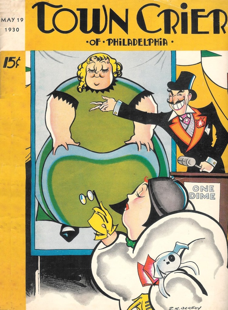
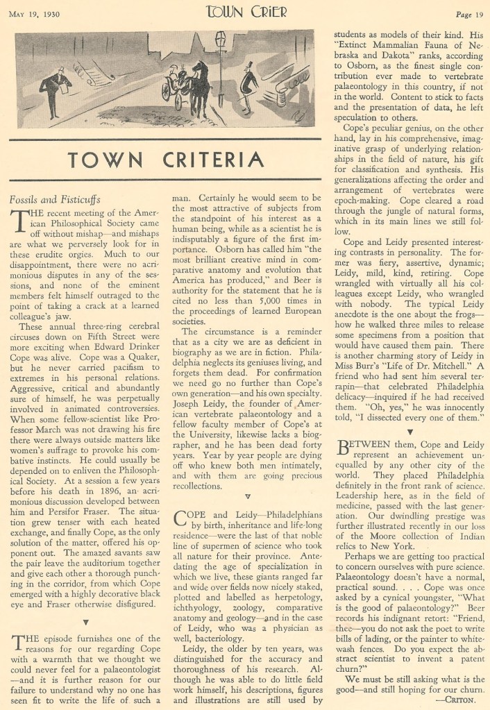
What might Philly have looked like? There is a ready answer in Town Crier of Philadelphia, “Philadelphia’s smart, new, humorous weekly,” as it was called in the issue of May 19, 1930. Here are some pages from that issue. Is the style familiar?

The magazine, appealing to “the cream of the Philadelphia market,” was to present “outstanding work . . . in a fresh and telling manner,” providing “smart Philadelphians” with “an amusing reflection of their tastes.” That sounds a bit like the build-up for Philly. And Morley must have been familiar with Town Crier. It was familiar with him, predicting that he would write a book “containing a whimsical loveliness and a description of the smell of doughnuts.” (This prediction itself may be nothing but whimsy, but, for what it is worth, in both Travels in Philadelphia and Kitty Foyle Morley seems to be drawn to doughnuts.)

Town Crier must have folded very quickly. It scarcely appears in online searches, though we learn that a similar magazine, The Chicagoan, lasted from 1926 to 1935. (Kitty says that another such magazine, intended for the “Detroit smart set,” might be willing to buy and adapt material no longer needed by the defunct Philly.)  If Town Crier seems to have left few traces, why not find out what happened to the magazine’s writers and artists? Please see also The TOWN CRIER and the Talkies: Jay Emanuel and Other Reel Fellows.

Kitty did not seem impressed by the staff of Philly magazine, the Main Line youngsters who treated the project as a lark and the legions of “broke cartoonists” (to the magazine’s lawyer, “bohemians sitting on the stairs”) and “newspaper paragraphers”  with material to sell. As for Town Crier, the names of the writers and artists might not leap off the page, and some appear only as initials (E.H.S., S.N.F., T.R.B.), brief names (Meg), or likely pseudonyms (Criton, Mary Scrapple, Philadelphia West). Some names have not been found, or were too generic to be pinned down: Francine von Schneeberg, Inigo Owen, William A. Armstrong. But the Alphonse B. Miller who wrote a biography of Thaddeus Stevens, as well as many book reviews on U.S. history, is probably the man who contributed an article about Hoover. We find a Harry M. Klingsberg who published fiction on legal subjects, a George H. Eckhardt who wrote about television and clocks, and a Harold W. Brecht who wrote novels. Rae Norden Sauder produced nonfiction for magazines and newspapers. Many continued in journalism: at the Evening Ledger, Sidney Lear, Henry T. Murdock (who became the Inquirer drama critic in 1950 and worked long enough to praise Barbra Streisand), and Eric M. Knight (who was also at the Public Ledger). While Knight was at the Town Crier, as we see in the ad below, his beat was “The Talkies.” Later, he wrote Lassie Come-Home.

TOWN CRIER OF PHILADELPHIA, 19 May 1930

Ivan H. “Cy” Peterman continued his sports reporting, at the Evening Bulletin and the Inquirer, and became a respected war correspondent for the Inquirer during World War II. Samuel Lipshutz is likely the writer of the same name, working around that time at the Record, who went to the New York Post, after being induced by his boss to change his last name to the more Anglo-Saxon Grafton, and became a widely syndicated columnist.

As for the artists, Bainton has not been identified, and two others should be identifiable as locally known artists, were it not for differences in styles and signatures: Angelo (perhaps Emidio Angelo) and Russell Henderson Esq. (perhaps Russell S. Henderson). NOTE: In the small print at the bottom of the second page above, we see that Emidio Angelo was the art director of Town Crier–that would seem to settle the matter!) Styles and signatures can change; E. K. Bergey, the cover artist, could well be the man who (using more than one version of his name and signature) went on to specialize in less stylized, more representational (“realistic” is not quite the word) covers for magazines with names like Spicy and Thrilling Wonder Stories. And two of the Town Crier artists, Richard Decker and George Shellhase (see “This Week” above, and the clown on the next featured page), went on to draw for the New Yorker itself.

TOWN CRIER OF PHILADELPHIA, 19 May 1930
The Centennial, OUR SHOW, and the Streets of Philadelphia

The Centennial, OUR SHOW, and the Streets of Philadelphia

The International Exhibition of 1876 can be seen as a Philadelphia story. It went up in West Philadelphia, honored the secular shrines in Old City, and showcased the culture, institutions, and burgeoning industrial might of the city.

But it could be said that Philadelphia was one thing, and the Centennial another. The Exhibition was set apart in a park, though linked by transit to the grid. It was bordered by temporary facilities for housing and amusement, though many visitors stayed in Center City and bought guidebooks that described the city as well as the Centennial. The Exhibition was itself designed to be, for the most part, temporary.

One could also say that Philadelphia was one thing, the Centennial another, and a burlesque like One Hundred Years a Republic or Our Show; A Humorous Account of the International Exposition (Philadelphia, 1876), by Daisy Shortcut, Arry O’Pagus, and A. B. Frost (that is, David Solis Cohen and his illustrator, H. B. Sommer), yet another. Cohen, writing in 1875, had fun with the past, from Columbus to the earnest women who had raised money for the celebration and the officials who had been planning it. But when he moved on to what might happen in 1876, he was free to invent tall tales, the more startling and unlikely the better. In one, the Colosseum is brought over and made the scene of a gladiatorial combat between Bismarck and the pope. And then there is the sad story of the Sphinx.

The fantasies in Our Show can be bizarre, the text and illustrations full of stereotypes we find offensive. It might seem better to stick to the official record, until we think what it must have been like to get dressed up and swelter through a Main Building with eleven miles of aisles and walkways and twelve thousand exhibits (Richard R. Nicolai, Centennial Philadelphia [Bryn Mawr, 1976], 58), and then confront Memorial Hall and its annex, with their thousands of works of art. No wonder C. D. Richardson offered the Centennial Cane and Chair Combined, “Especially Valuable for LADIES, who cannot possibly endure the fatigue without one.”

INQUIRER, 15 June 1876

The solemn Centennial visitors shown in wood engravings look as though they could use a laugh, and the book is often funny—just look at the “reviews” and the running heads.

Another reason to enjoy Our Show is that its fantasies are tethered to the streets of Philadelphia by local references, references that are set off at a slight angle from reality by altered names and strange contexts: the Alms House, Bedford Street Mission (unlikely scene of an “opium banquet”), Broad and Prime [Washington] Station, Cape May Diamonds, Darby, Richard J. Dobbins (a contractor who worked on Centennial buildings; he is given tongue-in-cheek credit for inventing Dobbins’ Electric Soap), lawyer Daniel Dougherty, Doylestown, Cherry Hill (N.J.), the City Troop, Egg Harbor (N.J.), Mrs. [John W.] Forney (the Forneys were a Centennial power couple), the German Hospital, Girard Avenue Bridge, Horticultural Hall on Broad Street, the House of Corrections, Jefferson Medical College, Manayunk, the Market Street Passenger Railway and other lines, former mayor Morton McMichael, rough and tough alderman William McMullin, Media, the Navy Yard, the Pennsylvania Railroad Bridge, Point Breeze Park (a horse-racing site used in Our Show to shelter the family of Brigham Young), Poplar Street Wharf, the Sawyer Observatory at the Exhibition, Schuylkill Falls Park, the Schuylkill Navy, Seybert’s Bell in Independence Hall, the Spring Garden Soup Society, the State Fencibles, Mayor William S. Stokley, the U.S. Mint, Walnut Street Dock, and West Chester.

He also mentioned well-known products and firms. Some, like Herring’s Hay-Making Machine, the Slawson fare box, Spalding’s Glue, and the Phoenix Iron Works, were not from Philadelphia. But many were. These references were not product placements. There are advertisements at the end of the book, but they are not for the firms mentioned in the book. No surprise there—respectable business owners might not have enjoyed being featured in a satire. The skeletal closing image of Alfred Timothy (i.e., Alfred Traber) Goshorn, the director-general of the Exhibition—

please see my page “Dismantling the Centennial” https://philadelphiaasadvertised.com/dismantling-the-centennial/

—was credited to F. Gutekunst, a prominent, award-winning photographer. The most extravagant fantasy involving a Philadelphia firm was the tale of the modern “Sphynx.” The original monument, placed on display on Belmont Avenue, was destroyed by “relic fiends.” A diplomatic crisis was averted when the firm of Robert Wood & Company created a modern version in bronze.

We can well believe that Cohen, a young proofreader and writer for local newspapers, including the Public Ledger, was known for “his successful and brilliant efforts as an interpreter of the main role in comedies and farces produced at the Amateur Drawing Room” and “[h]is rare gifts as a comedian . . . the means of delight to numerous auditors.” By the way, the efforts in the Amateur Drawing Room were made “to assist work in connection with the Centennial Exhibition” (Henry S. Morais, The Jews of Philadelphia [1894], 315).

Our Show has been made available online by the invaluable Internet Archive. The illustration of the Sphynx was improvised to join picture and text.