It was here, during the Centennial, that the telephone was introduced to the public. A sensation, no doubt, but what could one do with it? The Wasp, a satirical magazine from San Francisco, suggested in April 1877 that telephones would permit commanders to direct battles remotely, with feet up and uniforms clean and tidy, and allow transmission of live musical performances. In fact, that month saw a number of “telephone concerts” using a combination of telegraph and telephone technology. All the concerts had Philadelphia at one end or the other.
For the first time, people could experience, in real time, a distant event. Space had been “annihilated,” as the Bell company would later say. Still, the concerts seemed to dwindle into a novelty. As a novelty, the telephone was slow to realize its practical as well as its profound possibilities. An invention that could alter daily life in a hundred ways was used for entertainment, as electricity had been used for parlor games, or for electrocuting the occasional turkey.
Telephones would become part of daily life, but slowly and starting at the top. A new surgical procedure or improved stove benefits individuals immediately, one by one, but a single telephone is useless. Add another one, and you have begun to add value that increases with each new user as networks develop. The late 1870s saw not only the concerts, but also the leasing and installation of phones connecting buildings two by two in initially self-contained links, like speaking tubes or tin-can “telephones”: a business and the owner’s residence; a courthouse and a law office; two buildings in a factory complex. The phone was no longer a novelty. It became a convenience for professional people. But at this early stage, most people had no one to call.
The advertisement on the right shows that by 1888, a dozen years after the Centennial, talking with a machine was so common that it might shame forward-thinking people into writing with a machine (though they apparently can’t phone for further information).
For a snappier endorsement, we can sneak up to Boston for the 1885 lyrics of H. W. Durand’s “The Telephone.” It is full of slang–for example, “on the string.” Also, unlike the countless songs about love on the wire, it takes a broad view of telephone use. Church services could now be enjoyed by the homebound–very worthy. And–not so worthy–they could “skip the deacon with the contribution box.”
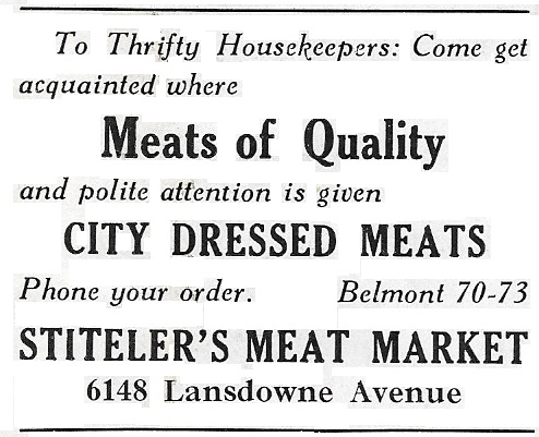
But back to the story. In the early 1880s, some businesses began to advertise their telephone connections to the public. Clearly, the networks were expanding.


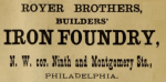
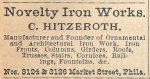
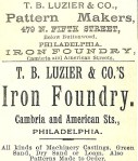
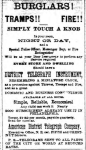
Many continued with older means of communication, with or without the telephone: calling (that is, in-person visits; see advertisements from Gara, McGinley & Co. and T. J. McCartney), “postals,” mail order catalogues, and the telegraph. The more ways to reach the customer, the better. Eventually the teletype joined the list.
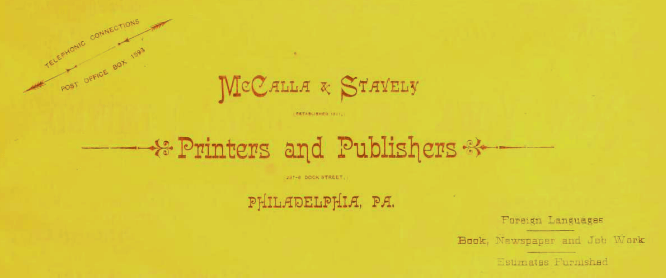


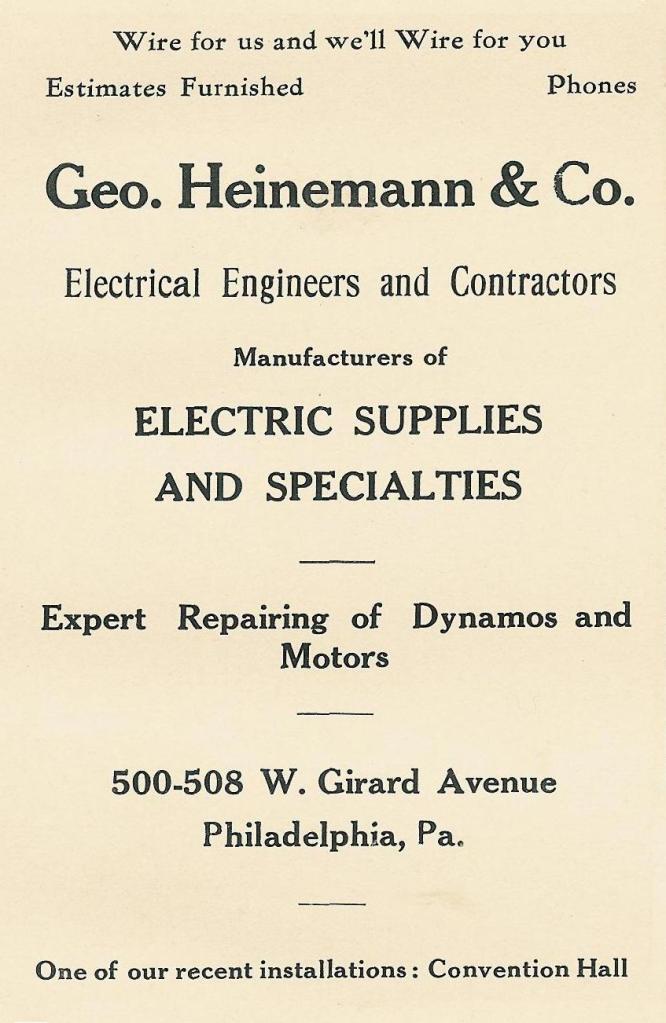
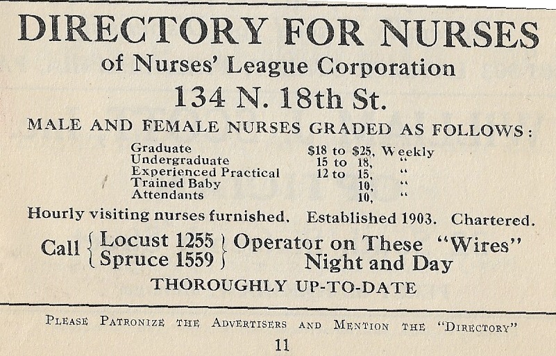
New technology, new vocabulary. One writer apologized in 1877 (Kate Field, ed., The History of Bell’s Telephone [1878], p. 25) for using “telephone” as a verb (not to worry–Shakespeare was fond of verbing; also note “postal us” in the Manheim Laundry ad above), but soon “telephone” and “telephonic connections” (see McCalla & Stavely 1882 above) were joined by “‘phone.” The equipment used gave rise to expressions like “get on the horn,” “ring us up” (Manheim Laundry again), and “wire” (as in telegraphy; see the Heinemann advertisement below, which could refer to the telephone: “Wire for us and we’ll Wire for you”) or “wires,” on which the Nurses’ League operators were available night and day.


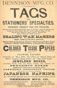
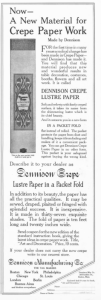
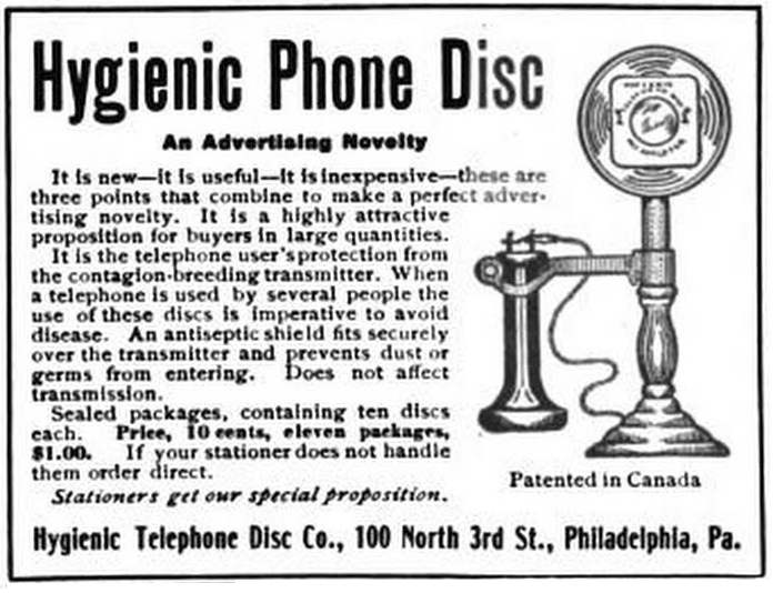
New technology, new accessories. Telephone nooks or niches became standard wall features in the days of stick phones. The nooks might have looked like shrines, but sometimes the instruments were hidden under, or behind, dolls (note the apparently disemboweled “telephone girl” below), or behind flower-garlanded crepe paper stands (top row) unlikely to turn up in an image search for “phone screen.”
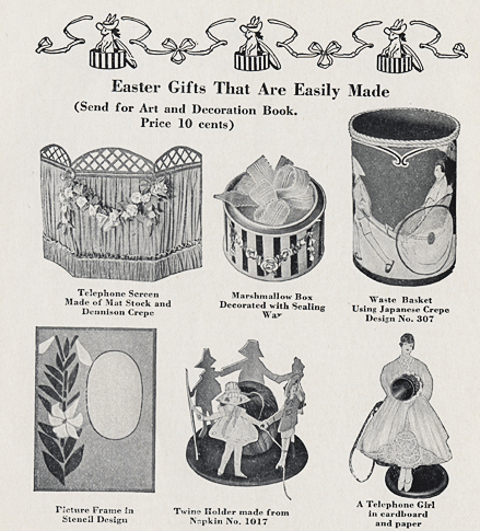
Another form of telephone screen:
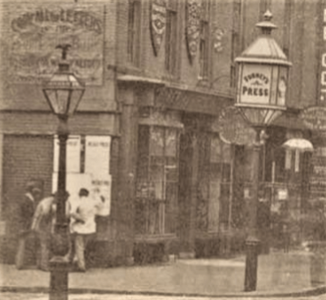
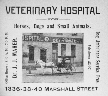
Meanwhile, telephone use became increasingly sophisticated: round the clock service (as noted); shopping by phone; long distance; public phones, often found in telephone offices, where the staff could assist and accept payment; and pay stations (pay phones) that were sometimes free. Pay phones started to move outdoors during the early 1900s. Special telephone numbers for animal ambulance service were offered (see below, from 1900 and 1907).


A new phrase, and complication, arose around the turn of the century: “both phones.” Rivals to the Bell system turn up in directories at the end of the nineteenth century. Then a serious contender appeared: the Keystone Company. Keystone was marketed as a local firm, a smaller system with faster service, and a friend of commerce: “When the Keystone rings, It’s BUSINESS.”

Advertising had to make room for “both phones.” An earlier post (“Marks, Manicules, and Markland: Street Signage in Nineteenth-Century Philadelphia”)
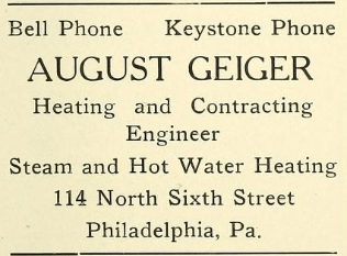
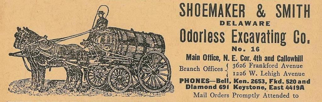
showed how much advertising space was devoted, before street numbering reform, to telling customers how to find businesses that did not have the good fortune to be on street corners. The physical addresses got sorted out, and then came “virtual” addresses: cable and telephone. In addition to a simple “both phones,” the ads might say “Bell and Keystone”; or give single, or multiple, numbers from one provider, or from both; or list a number or two with no mention of providers (customers could identify exchanges as belonging to Bell or to Keystone; in the Woodington ad, Locust is Bell and Race is Keystone). Note (Quaker City Stencil & Stamp Works) that the Keystone directory would list Bell numbers.

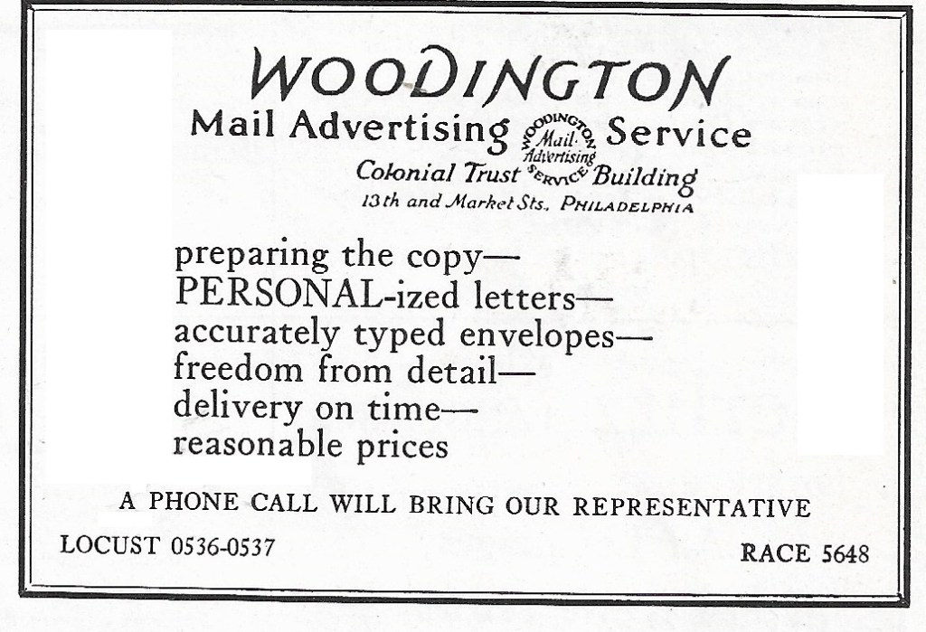


The advertisement below seems strange for the late 1920s, when direct dialing was coming into use. With an operator, the customer can provide a number or a name. Without an operator, the customer must have the number. “Telephone connection” offers little help.

Bell did not, of course, agree that Keystone owned the business community; a full-page 1908 advertisement asserted that “Philadelphia is practically all Belltelephoned” (verbing is not always a good idea), and that Bell was the “beaten path” for business.
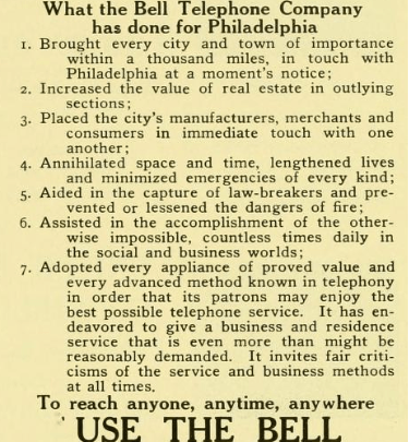
Here we find a claim that Bell had “annihilated space and time,” so that “every city and town of importance within a thousand miles” could be reached “at a moment’s notice.” Competitors are not mentioned. Despite the bravado, it’s odd that Bell gave the feeble command “Use the Bell,” while its rival got away with “when the Keystone rings.”
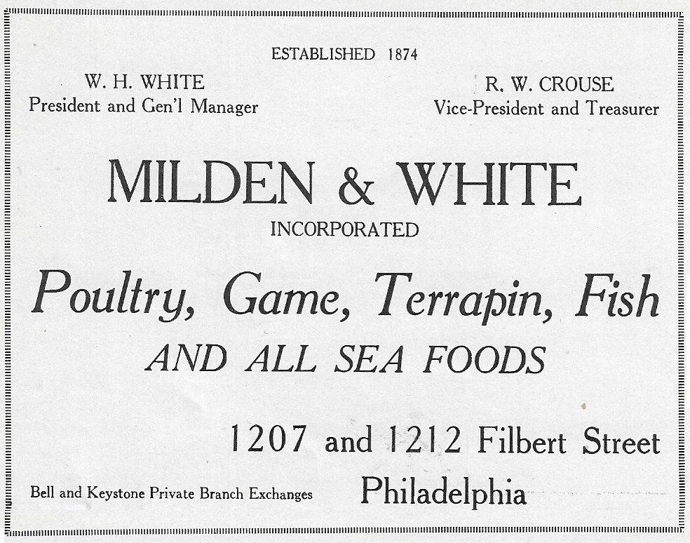
Bell had not yet vanquished Keystone, but “both phones,” which lasted longer in Philadelphia than in any other major city, did seem to duplicate, not enhance, services. For example, a newspaper soliciting want ads had to have operators for Bell and for Keystone customers. In the advertisement below, note the plural form in the phrase “private branch exchanges.” As I understand the term, the exchanges created a private system within a business, independent of the public system, for the sake of efficiency and economy. It could not have seemed efficient to set up and operate two of those exchanges.
At last Keystone was absorbed, and ended service in September 1945. “Both phones” has a monument: on the southeast corner of Filbert and Preston is a former Keystone building (note the keystone windows), now Philadanco headquarters. Across Preston Street, as though recalling the Manheim Laundry’s claim that “the telephone makes us neighbors,” is a former Bell Telephone building.